Android P 프리뷰와 함께 Design Support Library 28.0.0 alpha1이 공개되었다. 이 버전에 처음 포함된 BottomAppBar의 주요 속성과 FloatingActionButton을 배치하는 방법을 살펴본다.
이 버전에는 MaterialButton, MaterialCardView, Chip과 BottomAppBar가 포함되어 있다. 화면 아래쪽에 주요 액션을 배치하면 큰 화면에서도 엄지손가락으로 접근하기 쉽다.
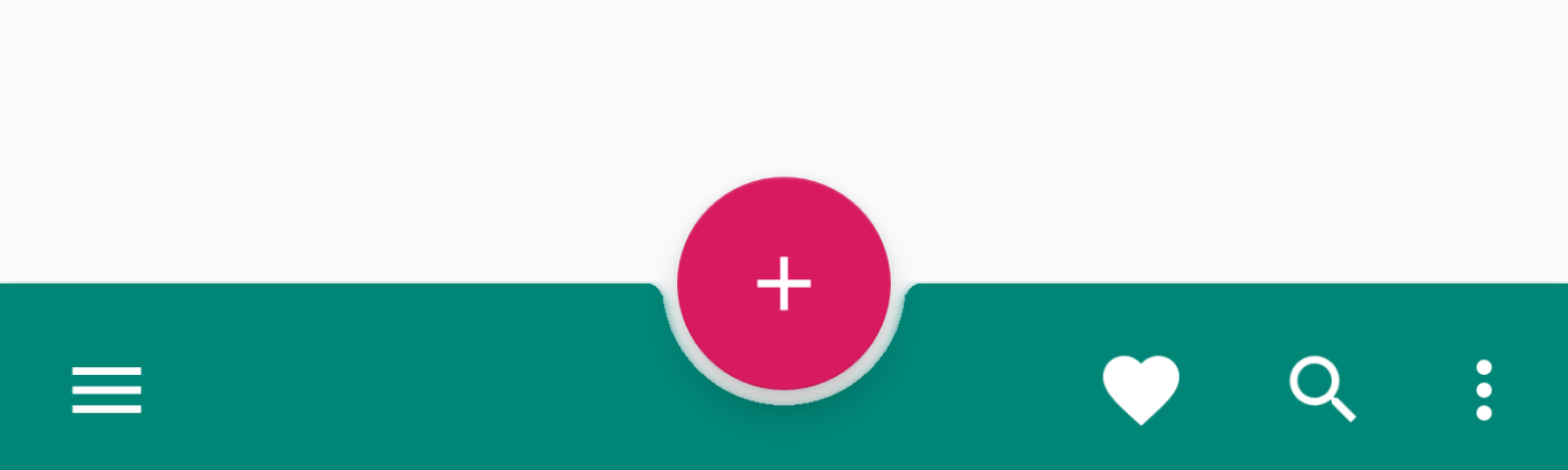 |
FloatingActionButton의 app:fabCradleVerticalOffset 속성으로 세로 오프셋을 조절할 수 있다. app:fabAlignmentMode를 사용하면 위치를 CENTER 또는 END로 바꿀 수 있으며, 런타임에 값을 변경하면 전환 애니메이션이 적용된다.
<android.support.design.widget.CoordinatorLayout
    xmlns:android="http://schemas.android.com/apk/res/android"
    xmlns:app="http://schemas.android.com/apk/res-auto"
    xmlns:tools="http://schemas.android.com/tools"
    android:layout_width="match_parent"
    android:layout_height="match_parent">

    <android.support.design.bottomappbar.BottomAppBar
        android:id="@+id/bottom_appbar"
        android:layout_width="match_parent"
        android:layout_height="wrap_content"
        android:layout_gravity="bottom"
        app:theme="@style/ThemeOverlay.AppCompat.Dark.ActionBar"
        app:popupTheme="@style/ThemeOverlay.AppCompat.Light"
        app:fabAttached="true"
        app:backgroundTint="@color/colorPrimary"
        app:fabCradleVerticalOffset="12dp"/>

    <android.support.design.widget.FloatingActionButton
        android:id="@+id/fab"
        android:layout_width="wrap_content"
        android:layout_height="wrap_content"
        android:layout_gravity="bottom|center_horizontal"
        android:src="@drawable/ic_add_white_24dp"
        app:layout_anchor="@+id/bottom_appbar"/>

</android.support.design.widget.CoordinatorLayout>
CoordinatorLayout에 BottomAppBar와 FloatingActionButton을 배치하고, FloatingActionButton의 layout_anchor 속성에 BottomAppBar의 ID를 지정하면 된다.
몇 가지 주의 사항
- Toolbar를 확장하여
BottomAppBar를 구현했지만setSupportActionBar()를 호출하면 중단됩니다. - 배경식을 변경하기 위해
android:background대신app:backgroundTint를 호출 해야 합니다. setTitle, setSubTitle은 재정의되고 비어있기 때문에 아무런 작동을 하지 않습니다.
Android P 프리뷰와 함께 공개된 초기 알파 버전이므로 API와 디자인은 이후 변경될 수 있다. 큰 화면에서 주요 액션의 접근성을 높이려는 방향을 확인할 수 있다.
그리고 알파 버전에 들어 있는 추가 레이아웃에 대해 간단하게 언급 하자면..
Chip, ChipGroup
키워드나 태그를 하나씩 보여주는 태그뷰이며 그룹으로 관리가 가능하며 다양한 스타일(Action, Filfer, Choice)를 기본으로 제공합니다. ingleSelection속성을 이용하면 그룹중에 하나만 선택 할 수 있는 기능도 지원합니다.
MaterialCardView
CardView의 확장버전이며 strokeColor와 strokeWidth 속성이 추가되었습니다.
MaterialButton
기본 Button에서 cornerRadius를 지원하여 라운드 처리가 가능하며 아이콘을 추가 할 수 있는 속성이 추가되었습니다.